Pimp My DocC Documentation

I am a Software Engineer working on open source and enterprise mobile SDKs for iOS and MacOS developers written in Swift. From 🇩🇪 and happily living in 🇺🇸
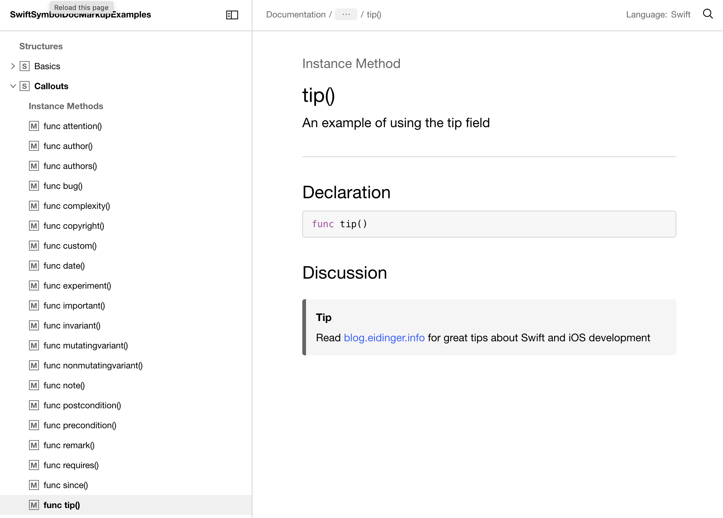
Documentation webpages produced by DocC come with a default visual styling that is, I feel sorry to say it, boring. Callouts are not colorized per default (exception: warning)
In this blog post, I'll talk about how to customize the appearance of your documentation pages. These customization options are available with Swift 5.8, distributed with Xcode 14.3 (Beta).
You don't have to change the generated HTML / CSS, which is great news. You adjust the styling by adding a theme-settings.json file to the root of your documentation catalog.
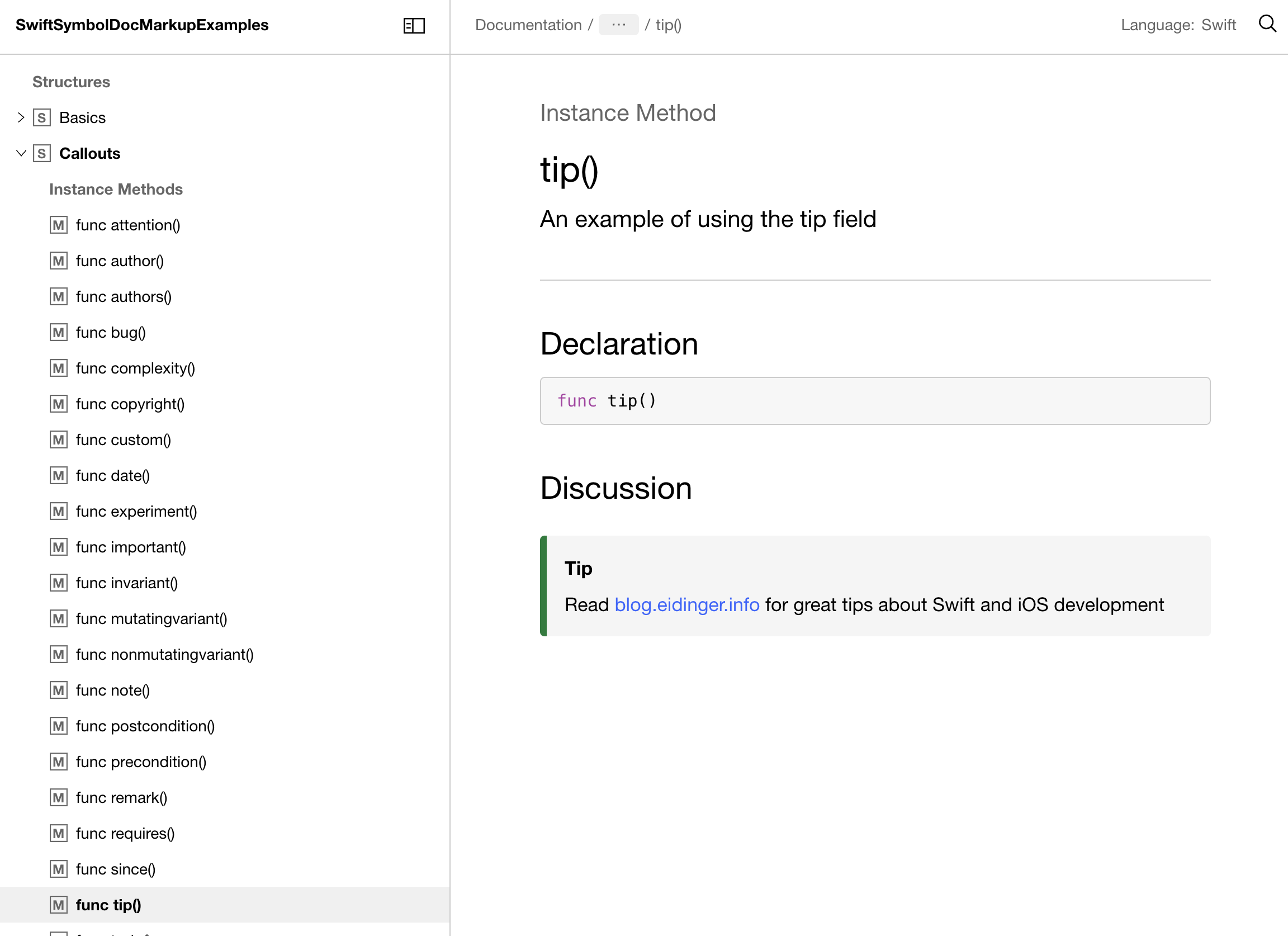
Let's add a dash of color to a tip callout. A callout is named "aside" in DocC. To colorize the border of the tip aside:
{
  "theme": {
    "color": {
        "aside-tip-border": "rgb(0, 124, 55)"
    }
  }
}
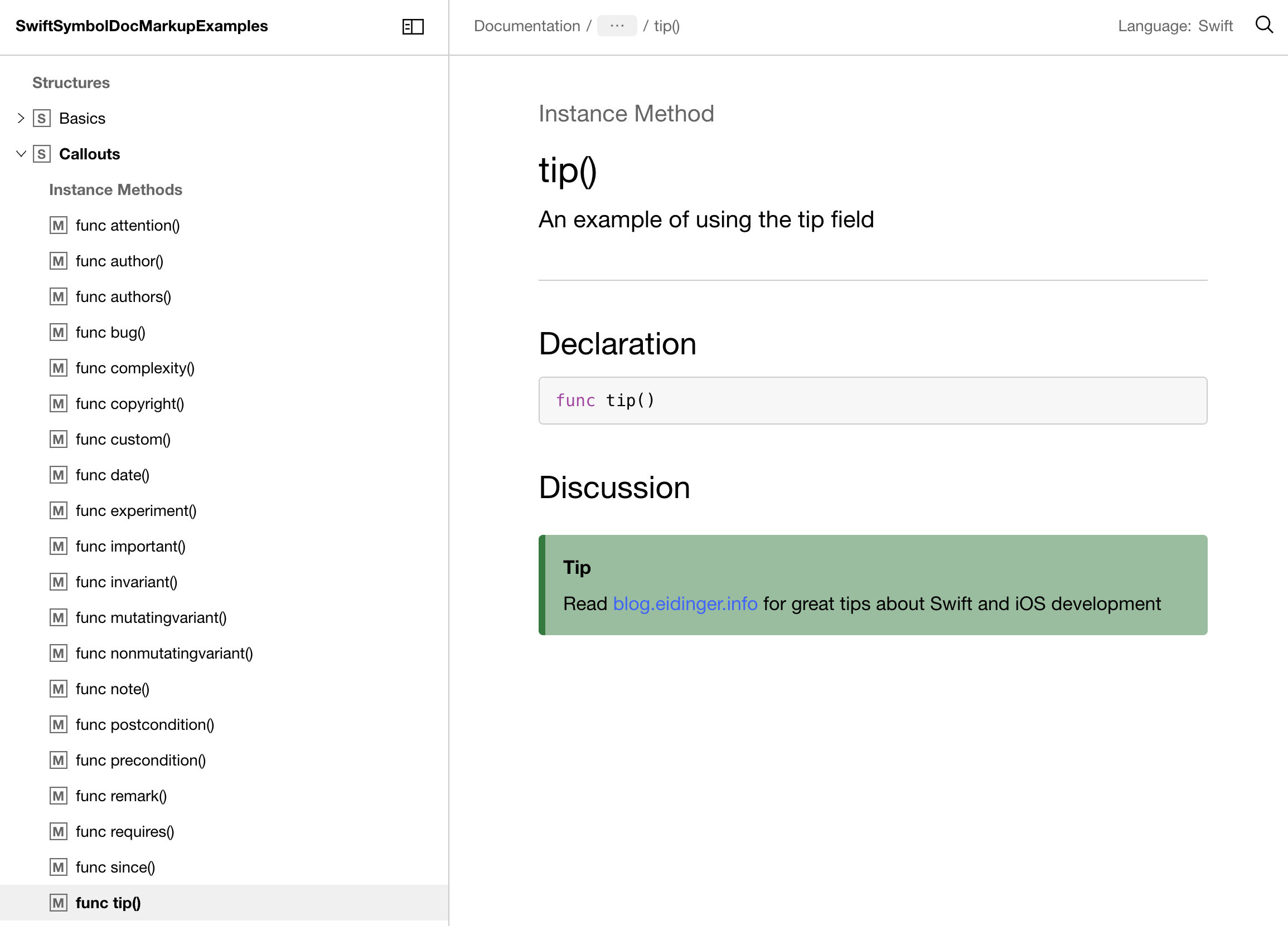
Let's make it more colorful by applying a background color
{
  "meta": {},
  "theme": {
    "color": {
        "aside-tip-border": "rgb(0, 124, 55)",
        "aside-tip-background": "rgb(0, 124, 55, 0.5)"
    }
  }
}
I hope the DocC renderer will create default colors for asides one day. There is an open GitHub issue 🤞
You saw that it is possible to customize a specific element (here: aside), but you can change the appearance of more elements and colors/fonts globally.

The Open API specification for the theme-settings.json file is pretty neat. Even more helpful is the complete example of a fully customized documentation website which is mentioned in the Customizing the Appearance of Your Documentation Pages article on swift.org.